
What the Color of the Year Should Have Been: Rethinking Pantone 2026
Creative direction, writing, and styling by: Emme Serafino
Photography and artwork by: Sylvia Vileno
Modeled by: Kaili Whitmer, Isabelle Jean, Jordan Rampulla,
Sophia Sousa, and Leila Bakilana-Ritz
Photoshoot location: Animation Capture & Effects Lab
When Pantone named Cloud Dancer as the 2026 Color of the Year, the intention was obvious: softness, stillness, a reset in an overstimulated world. But the response wasn’t calm or celebratory — it was divided, critical, and in many cases, openly dismissive.
On social media and in fashion conversations, Cloud Dancer didn’t land as a symbol of freedom or clarity. It landed as absence. Some people saw elegance. Others saw emptiness. In a year already defined by emotional burnout, financial pressure, and creative fatigue, white didn’t feel calming — it felt distant.
White has always meant luxury — clean, controlled, and untouchable. But that energy feels distant right now. Fashion wants connection, not perfection.
This isn’t about rejecting softness.
It’s about choosing emotion over emptiness.
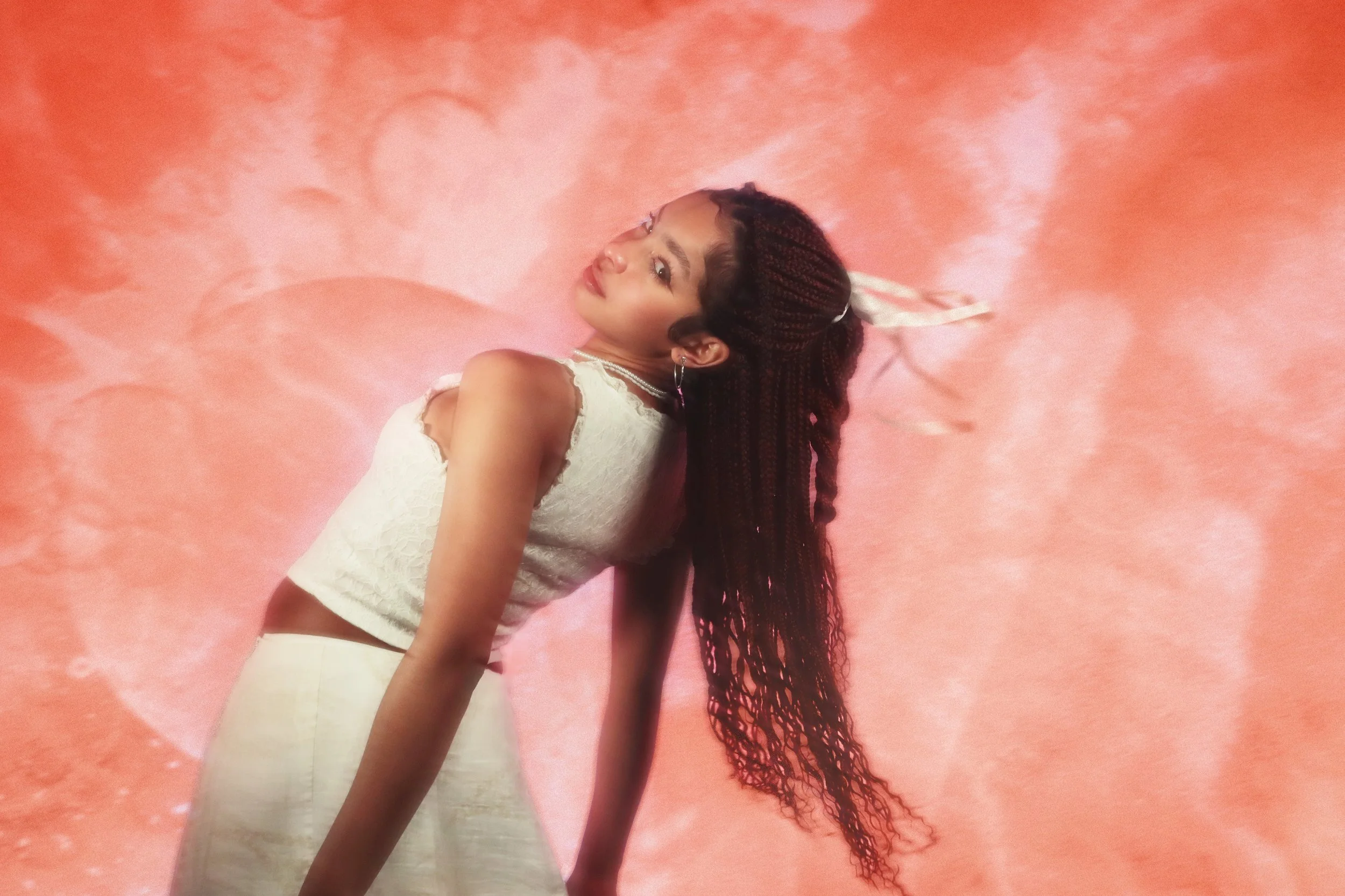
PANTONE 19-3936 TCX — Skipper Blue
Future Dusk
Skipper Blue feels like nightfall with purpose. Deeper than navy, moodier than indigo, it’s cinematic without being dramatic. Against white, it reads like emotional armor — steady, elegant, and quietly powerful.
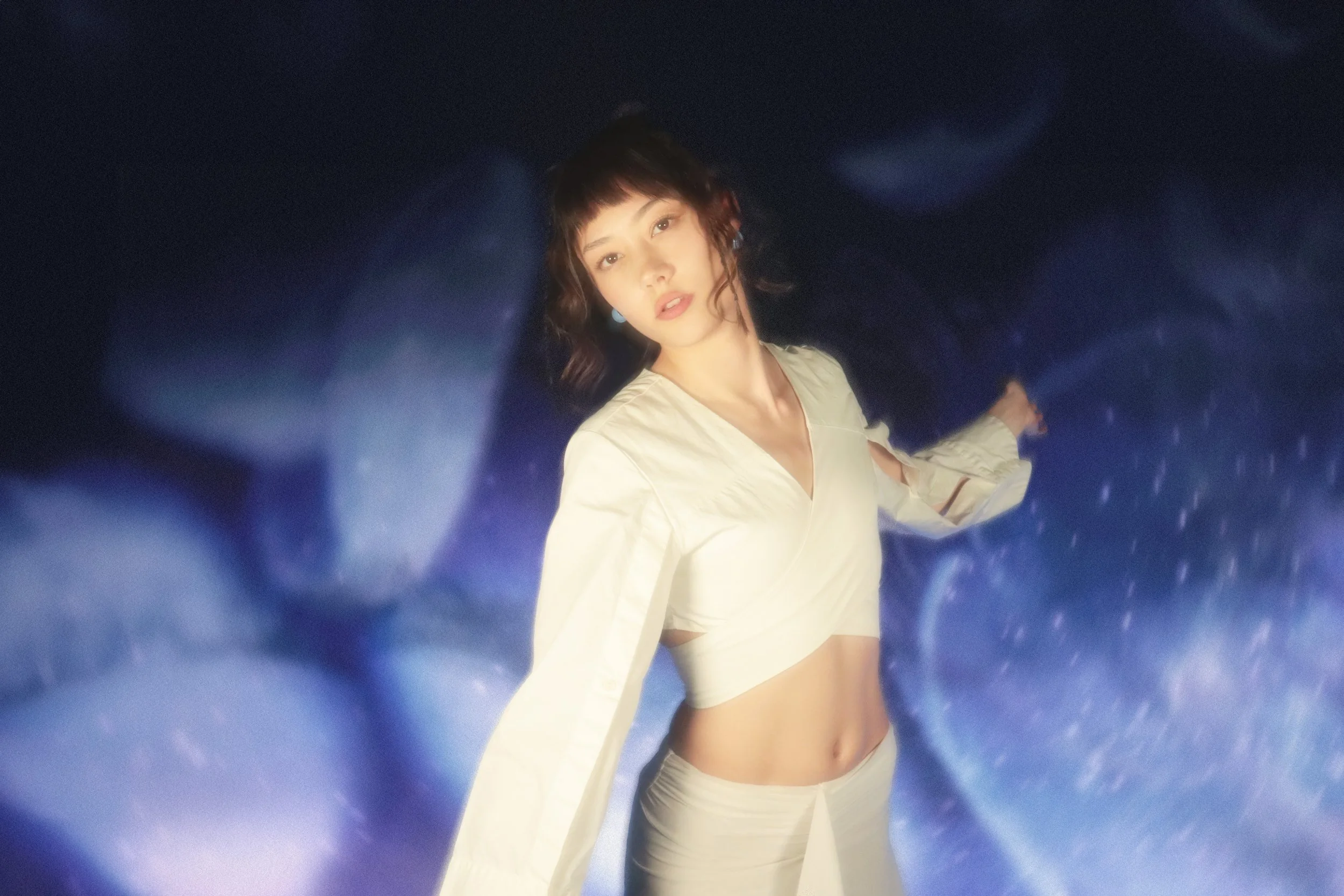
Kaili Whitmer in Skipper Blue
Mood: mysterious, grounded, intentional
Why it works: It functions as a new neutral for uncertain times, offering strength without relying on volume or excess.
PANTONE 11-0618 TCX — Wax Yellow
Soft Light
Wax Yellow doesn’t try to perform. It glows. Warm, diffused, and calm; it feels closer to candlelight than spotlight energy. Against white, it becomes optimism without pressure, permitting you to feel excellence.
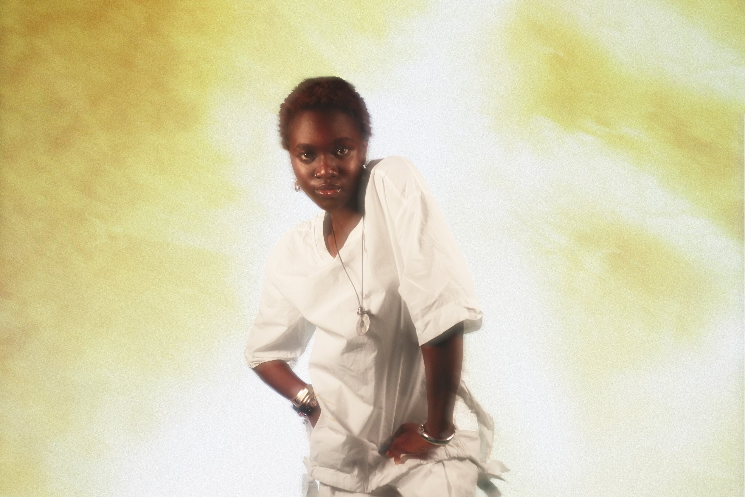
Isabelle Jean in Wax Yellow
Mood: calm, clarity, warmth
Why it works: It represents a lasting kind of joy — one that exists beyond trend cycles and aesthetic fatigue.
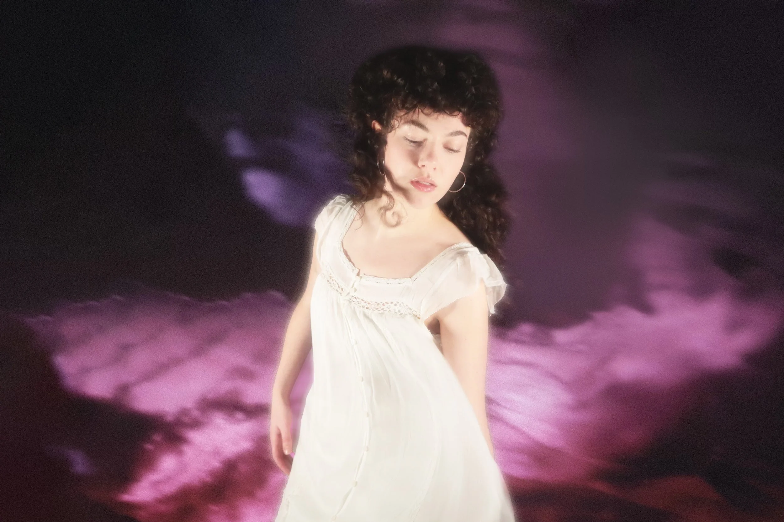
Cherry Lacquer
Fig is rich without excess. Glossy but grounded. Indulgent but wearable. Next to Cloud Dancer’s restraint, it feels intentional — a color that’s chosen, not defaulted to.
PANTONE 15-4415 TCX — Milky Blue
Familiar, Forward
Milky Blue feels like something you already trust: worn denim, sun-faded postcards, secondhand pieces with stories attached. Against white, it feels nostalgic; warm and full of memories.
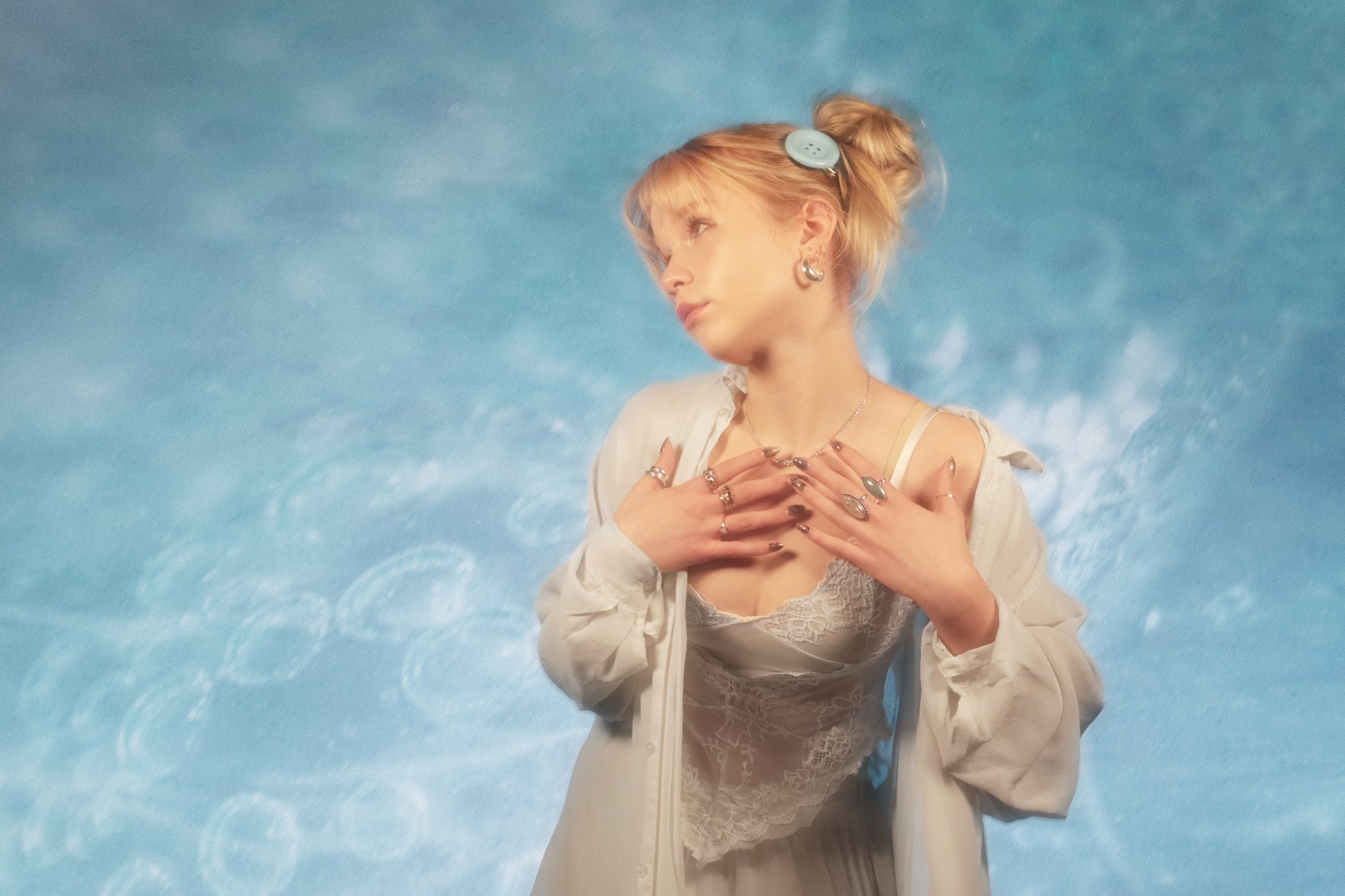
Sophia Sousa in Milky Blue
Mood: ease, trust, continuity
Why it works: It prioritizes memory over novelty, reinforcing a move away from fast trends toward lasting relevance.
PANTONE 16-1451 TCX — Nasturtium
Controlled Heat
Nasturtium doesn’t whisper — it pulses. Sharp, expressive, and alive, it’s energy with intention. Against white, it feels graphic and artistic instead of chaotic.
Closing Note
Color isn’t about filling space anymore.
It’s about earning attention.
2026 isn’t about dressing for escape — it’s about dressing for reassurance, identity, and something real. The Color of the Year didn’t need to disappear into white. It needed to show up. These colors do.